GEMVARA
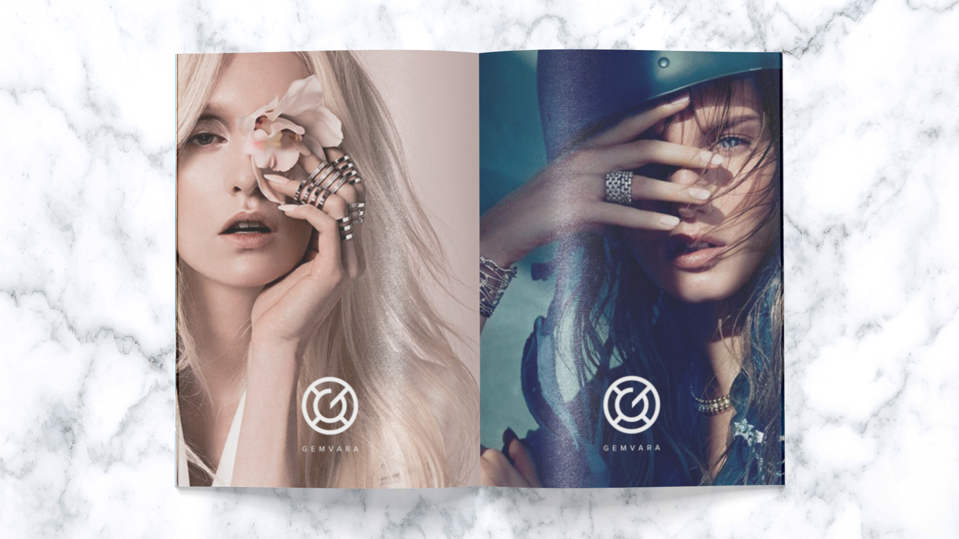
Gemvara is an online retailer with a unique model letting customers customize every feature of a piece of jewelry.
The logo I created is inspired by a solitaire diamond when viewed from above. I wanted it to feel strong and structured like the properties of a diamond itself.

CHICAGO BEYOND
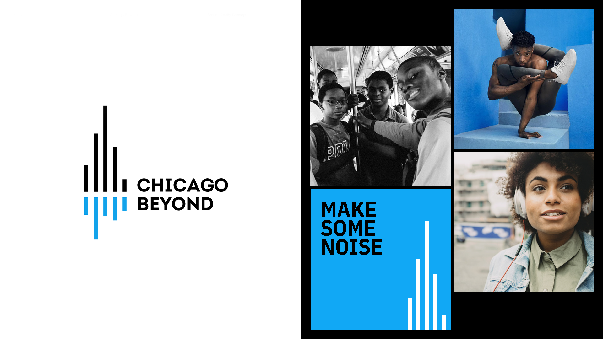
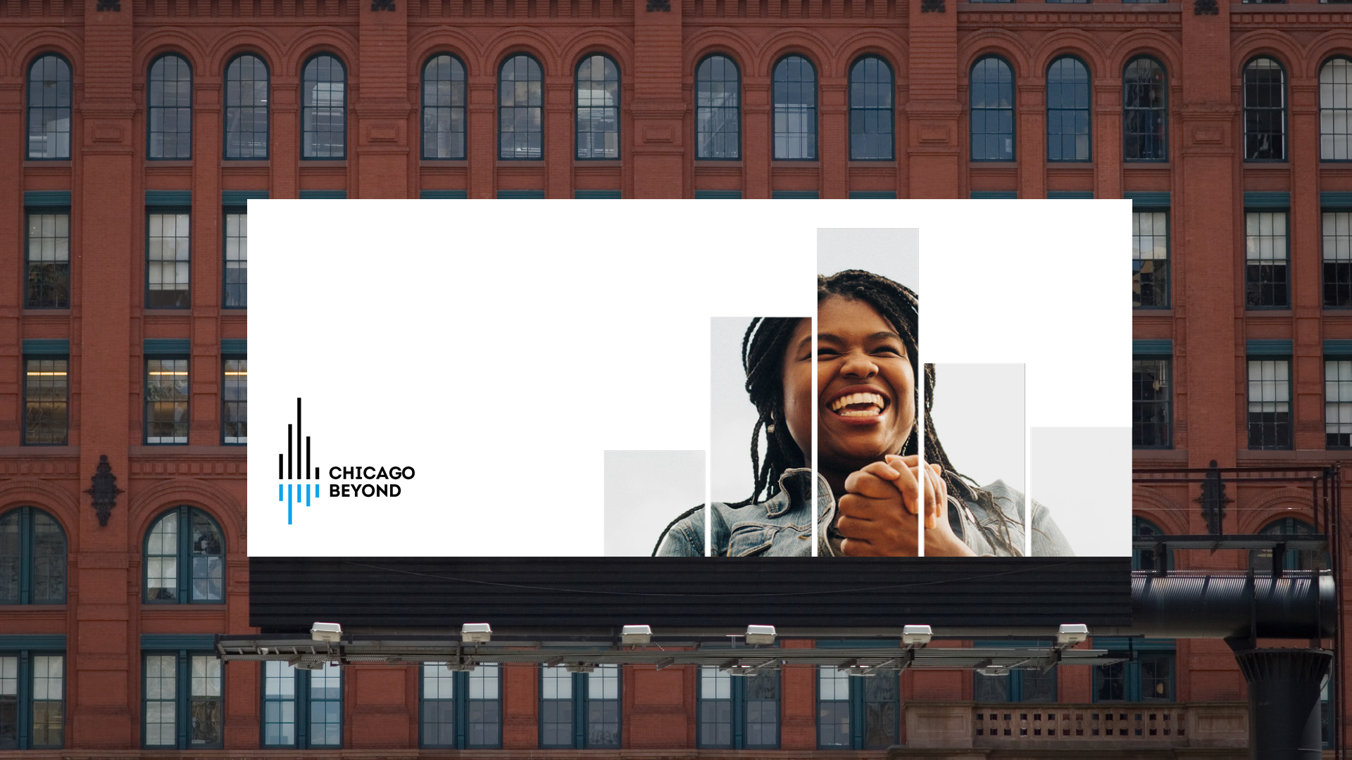
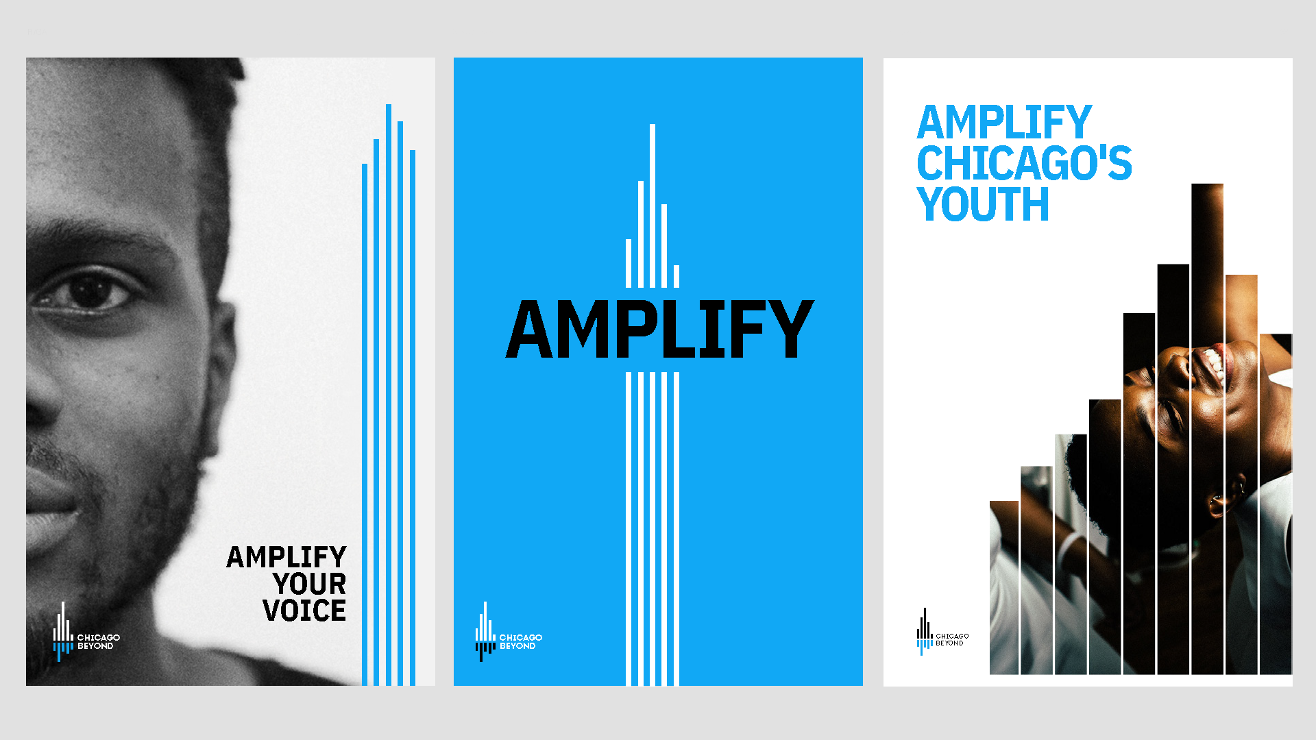
Chicago Beyond is an organization that invests resources in individuals and groups that provide equitable opportunities for Chicago’s underprivileged youth.
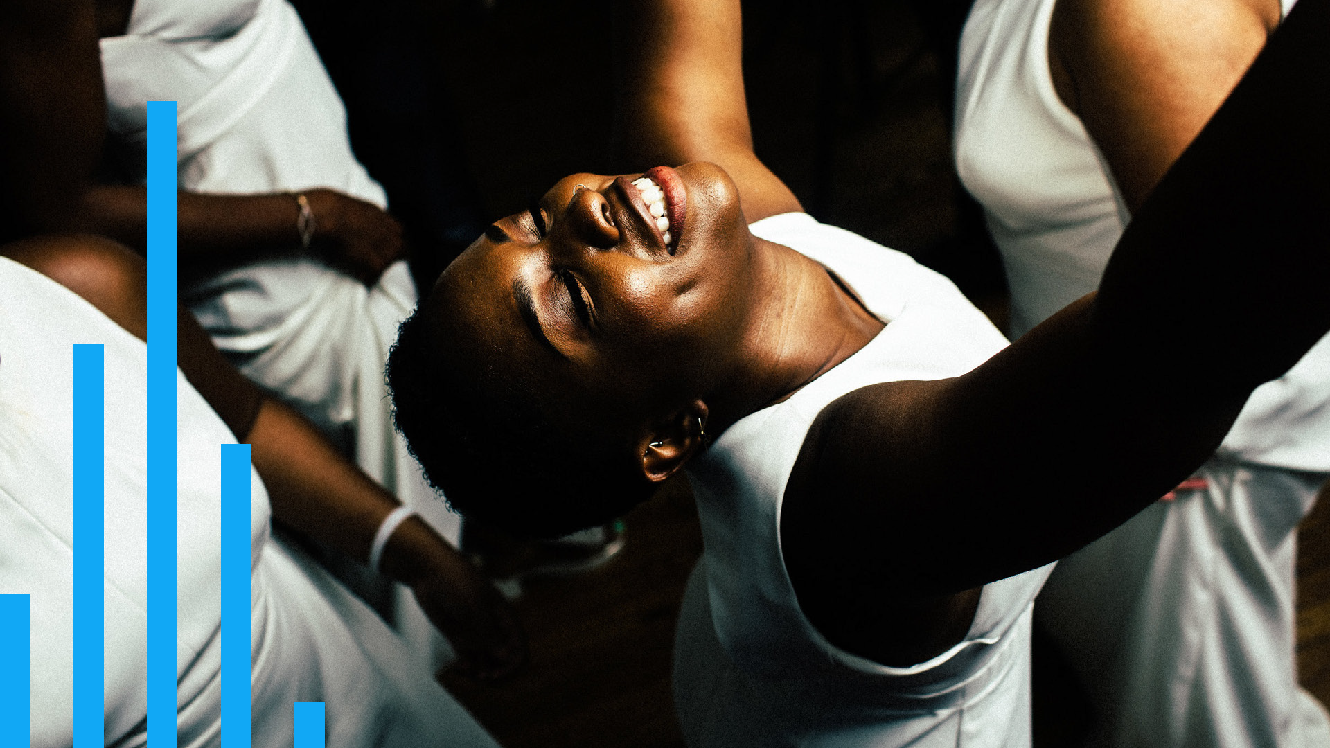
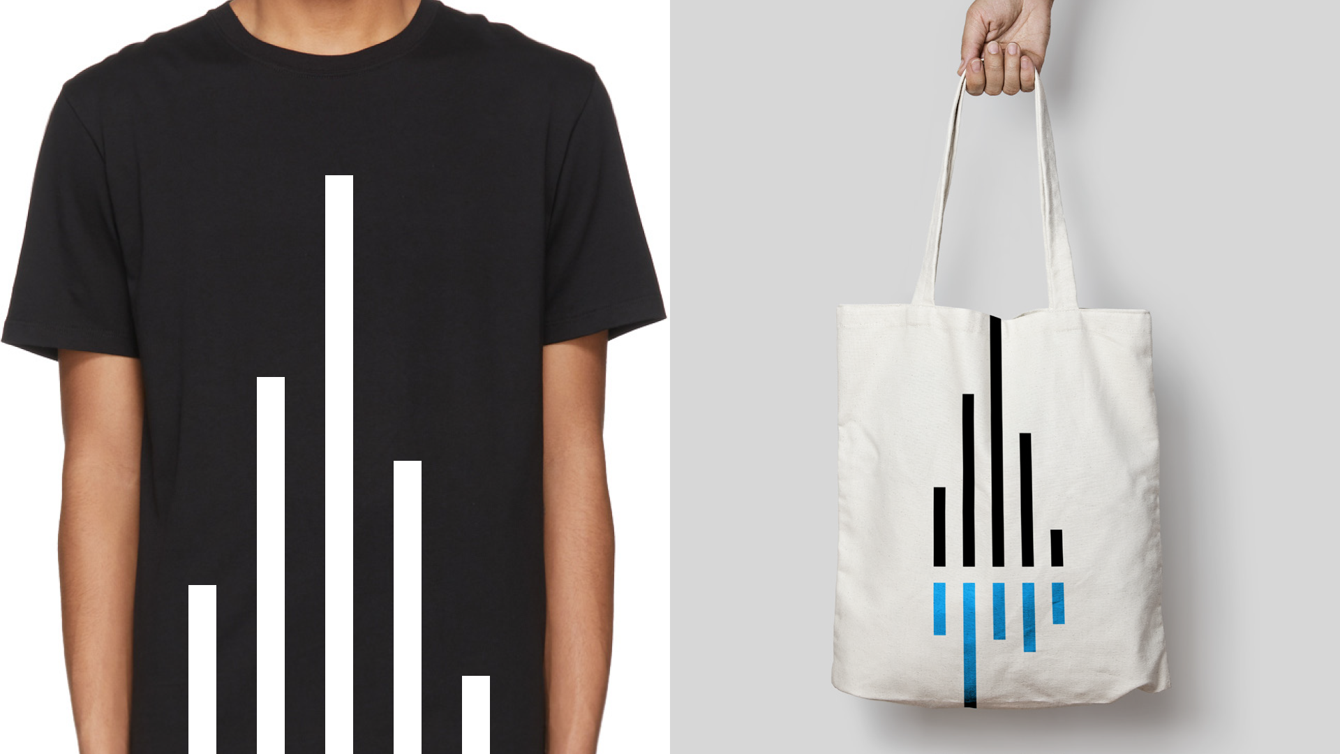
The logo I designed expresses two ideas: it’s a nod to the city’s ever-changing skyline and also a graphic equalizer symbolizing the voice of Chicago’s youth.

SANDISK
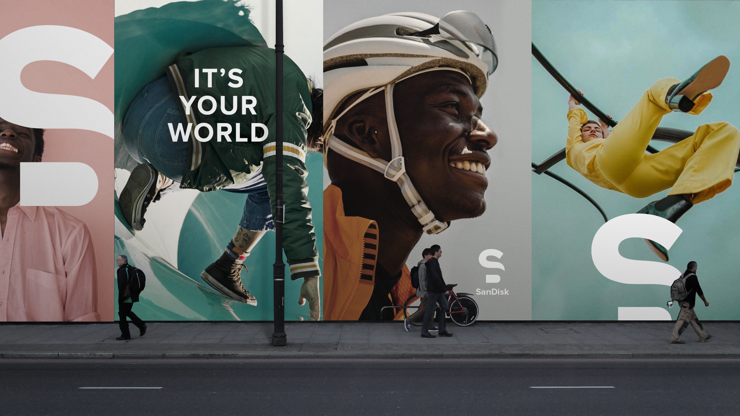
Sandisk is a technology company that’s in the business of storage—capturing memories, ideas, and data. So for this mark, I wanted to draw a connection between two worlds: the world that you capture and the world you create. The logo becomes the bridge connecting these two thoughts together through the formation of an “S” and a “D”.

GALLO WINEBOT
We pitched an AI, Winebot, to Gallo as an always-on personal sommelier. The bot could help you pick out the best bottle for any occasion all without you having to know a thing about wine. This logo is meant to evoke both a robot and wine glass nodding to the technology and theme.

ROSE AI
Rose is an AI we built for The Cosmopolitan of Las Vegas. You can check out more on her on the project page here.
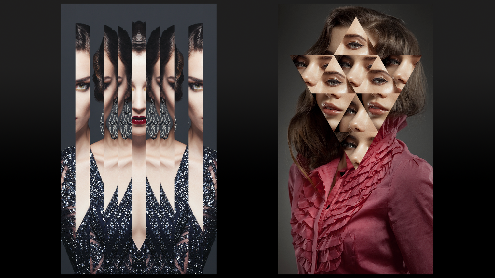
When we designed her personality and responses, we also wanted to explore a look for how she shows up in different media. Rose is the resident mischief-maker and ultimate insider of the resort, and as part of her mystique, we wanted to keep her identity hidden because she can be anyone at The Cosmopolitan.
I wanted to create a look that used strong geometric treatments to distort and hide her identity almost as if she was from another dimension—a technological one. This was the look we used for the testing phase of the development process. When she was finalized, I evolved her look to the one seen on the project page.
